A math teacher obtained the following scores from a class of 45 students. Which of the following is the best way to display the frequency of each day of the week?
|
Test score |
50-59 |
60-69 |
70-79 |
80-89 |
90-99 |
|
Number of students |
10 |
4 |
9 |
20 |
2 |
Scatterplot
Pie graph
Line graph
Histogram
Correct Answer : D
In order for the teacher to better visualize the test performance for his class, he needs to present the mark distribution in chart form. A better chart visualizer is the histogram, which will show the frequency of marks against range of test scores. A bar graph will not be used because the rectangles need to touch one another.
In a bar graph, the rectangles do not touch each other. Therefore, it will not be a good chart visualizer.
TEAS 7 Exam Quiz Bank
HESI A2 Exam Quiz Bank
Find More Questions 📚
Teas 7 Questions: We got the latest updated TEAS 7 questions
100% Money Refund: 100% money back guarantee if you take our full
assessment pass with 80% and fail the actual exam.
Live Tutoring: Fully customized live tutoring lessons.
Guaranteed A Grade: All students who use our services pass with 90%
guarantee.
Related Questions
Correct Answer is C
Explanation
to find the average time the athlete runs in 1 mile; we find total distance and total time the athlete takes in running.
Total distance run by athlete=7+3=10 miles
Total time=45+15 =60 minutes
The athlete runs 10 miles in 60 minutes. For the athlete to cover 1 mile, he will run for a time less than 60 minutes. Thus, in 1 mile, the athlete takes:
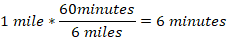
So, in 6 minutes, the athlete covers 1 mile.
Correct Answer is A
Explanation
We need to form a mathematical expression from the given word problem.
Let the unknown number be x.
Thrice a number is three times = 3x
Twelve less than thrice a number = 3x-12
Thus, the mathematical expression from the word problem is 3x-12
Correct Answer is D
Explanation
We use 1 L =1000 mL to convert between the two units. The conversion options of interconversions are:

And

We want millimeters, use the second option to change L to mL as:
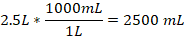
Therefore, 2.5 L is equivalent to 2500 mL.
Correct Answer is C
Explanation
In a bell-shaped curve, the data distribution is symmetric around a single peak. The centering of data around a single peak means the mean, mode and median of the test are all equal to each other.
Correct Answer is A
Explanation
An independent variable is a change that when modified brings a change in other variables. In this case, the person increases his climbing rate, calories burned, distance traveled and energy used increases. Therefore, the walking speed is the independent variable while other variables are dependent.
Correct Answer is C
Explanation
We are asked to find mL equivalent in 1.5 teaspoons. To carry out the operations, we utilize dimensional analysis to solve this problem as follows.
Converting between teaspoon and mL uses the following conversions:

Or

Since we want to remain with mL, use the second option and proceed as follows.
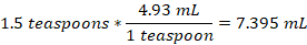
Thus, 1.5 teaspoons is equal to 7.395 mL
Correct Answer is D
Explanation
Here we convert between feet and yards. We know 1 yard =3 feet. Then, 27 feet to yards will be:
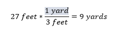
Thus, 9 yards is equal to 27 ft.
Correct Answer is C
Explanation
In this problem, we need to find the amount of gratuity the couple will leave. The gratuity is 16% of the total bill. Before solving the problem, the following are terms and their meaning in percent problems:
- Is means equals
- Of means multiply
- What means unknown (variable)
If we let x be the amount of gratuity, then translating the given problem into a mathematical equation becomes:
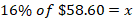
Now we evaluate the above equation noting that of means multiply.
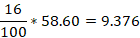
So, the value of x=9.376 and to the nearest cent, x=9.38
There, a couple will leave a gratuity of $9.38.
Correct Answer is D
Explanation
We two conversions when asked to convert between kg and lb

And

We need kg equivalent of 220 lb, therefore we use option 1 and carry out the conversions as follows:
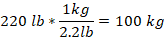
Thus, 100kg is equal to 220lb.
Correct Answer is D
Explanation
In order for the teacher to better visualize the test performance for his class, he needs to present the mark distribution in chart form. A better chart visualizer is the histogram, which will show the frequency of marks against range of test scores. A bar graph will not be used because the rectangles need to touch one another.
In a bar graph, the rectangles do not touch each other. Therefore, it will not be a good chart visualizer.
This question was extracted from the actual TEAS Exam. Ace your TEAS exam with the actual TEAS 7 questions, Start your journey with us today
Visit Naxlex, the Most Trusted TEAS TEST Platform With Guaranteed Pass of 90%.
Money back guarantee if you use our service and fail the actual exam. Option of personalised live tutor on your area of weakness.